About Amy Fetzer
Amy Fetzer is a journalist, author and consultant, specialising in sustainability and health. Her book, Climb the Green Ladder: Make Your Company and Career More Sustainable, Wiley, is a guide to help and inspire others who also want to make a difference by giving them the tools and motivation to change their workplace from within.
Amy's work focuses on creating engaging communications - from environmental white papers to magazine articles - that inform, entertain and inspire. Enthusiastic, passionate and personable, Amy's clients range from the BBC, Green Futures and The Guardian to Hewlett Packard, Sodexo, The Sunday Telegraph and My Weekly. Amy has extensive experience of health, lifestyle, travel and youth and childrens features, as well as web content and brochure copy. Amy is conscientious, reliable and proficient at meeting tight deadlines in print and web-based environments.
For more information on Climb the Green Ladder, please visit www.climbthegreenladder.com, or visit Climb the Green Ladder on Amazon!

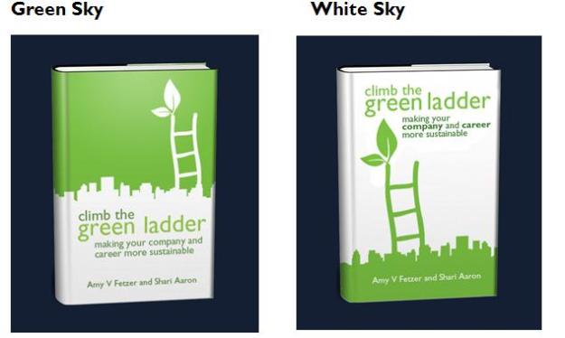
Definately white sky and green ladder
Hello Shari,
Very exciting! Well-done!
The book cover should reflect the title and sub-title. A picture that shows an individual climbing the green ladder to a sustainable company.
Regards,
Stelios
Choose the one with the green ladder of course! Otherwise you’re climbing the white ladder on the jacket which would seem a bit rum given the book’s title, even if the ‘green’ has other meanings…
i like the white sky with creamy green foreground. though i love strong colors but your book cover looks well. try my new logo, ‘the midas touch’ at my blog..http://ayermatahari.wordpress.com
All good points – it’s interesting because it’s working out which cover is the one that would make someone pick up the book vs the cover that is the most visually attractive. Interestingly, in research we’ve done in book shops, people seem to respond better to the green sky when the cover is life-size in front of them. Thanks for all your feedback though – it’s all very interesting.
I think climbing into the green sky and becoming ‘green’ is more symbolic – though maybe not from ‘pure white’?? Does that help?
Which do you think will best grab the attention of your target market?
Agree with Diana AND the green is not dark enough to give good contrast for people with eyesight problems.
MAYBE stick with the white sky design but make the green lot darker?
Although simple and graphic, the cover is nonethelss too ‘soft’ and rather unoriginal for the message. Why not find a decent illustrator?